Allyson Letteri, VP of Marketing
Handshake’s new brand platform—Find your next—invites students, employers, and universities to accomplish their early career goals with us. And it’s paired with an updated look that highlights the vibrant community we’re building.
When I was hired this spring as Handshake's new VP of Marketing, I was eager to begin because my first project was leading a refresh of our overall brand. We wanted the new brand to help students understand that we are the best job platform and early career community for them. One of our core values is students first, and everything our students encounter on Handshake needs to reflect that we’re the place for them to find their next job and start a meaningful career. Additionally, as a 3-sided community, our brand message must also resonate with employers trying to hire early career talent, and universities ensuring their students embark on fantastic jobs after graduation.
Our first step was to interview more than 100 stakeholders, including employees, students, top employers and career center leaders. We needed to define what Handshake stands for, how people view our brand, and how we differ from other options. We also wanted to understand which of our values and benefits may not be shining through in our experience.
Some key takeaways from these interviews:
Handshake is a game changer for each of our core audiences.
- Employers are reshaping their on-campus recruiting by connecting with students before they come to campus. Students now have access to more jobs because hiring managers can look beyond a limited target school list. And universities have a seamless process to connect with employers and their students.
Handshake is unlike any other community available to students.
- Students on Handshake have the unique ability to see who previously had an internship they want, and reach out to that student directly to get their advice. Hundreds of thousands of employers across every industry are also actively messaging students, engaging with them in a way they haven’t before.
Handshake supports the journey and delivers the outcome.
- Handshake does more than connect employers with qualified applicants. They now have data about talent availability at schools across the nation that makes it easy to decide which students to interview. Universities gain insight into the overall graduating talent economy, and students benefit from the content that other students, employers, and their career centers contribute to figure out what jobs they want.
We knew our brand platform needed to reflect the personal and unique experience of each audience using Handshake—a community of people achieving their career and hiring goals. We also needed to convey that Handshake is a forward thinking and progressive platform that drives change in users’ lives. That’s why we decided on Find your next. It invites our users to look ahead, not at lofty and intimidating “dream job” scenarios but at the steps needed to build a career, a team, and a future.
Defining our brand attributes came easily after this, and they reflect our mission to democratize opportunity and support each user’s journey. Handshake is real, intentional, and supportive. We know the job search can be daunting, especially for students from underrepresented backgrounds—that’s why being supportive is vital. We are honest and practical—helping students, universities, and employers get from point a to point b. Whatever the goal, our users can find the resources they need to make it a reality. Handshake is also vibrant, actionable, and optimistic. The Handshake community is full of youthful energy and spirit. We know that opportunity awaits for those ready to take the next step. We see the possibilities for a better tomorrow.
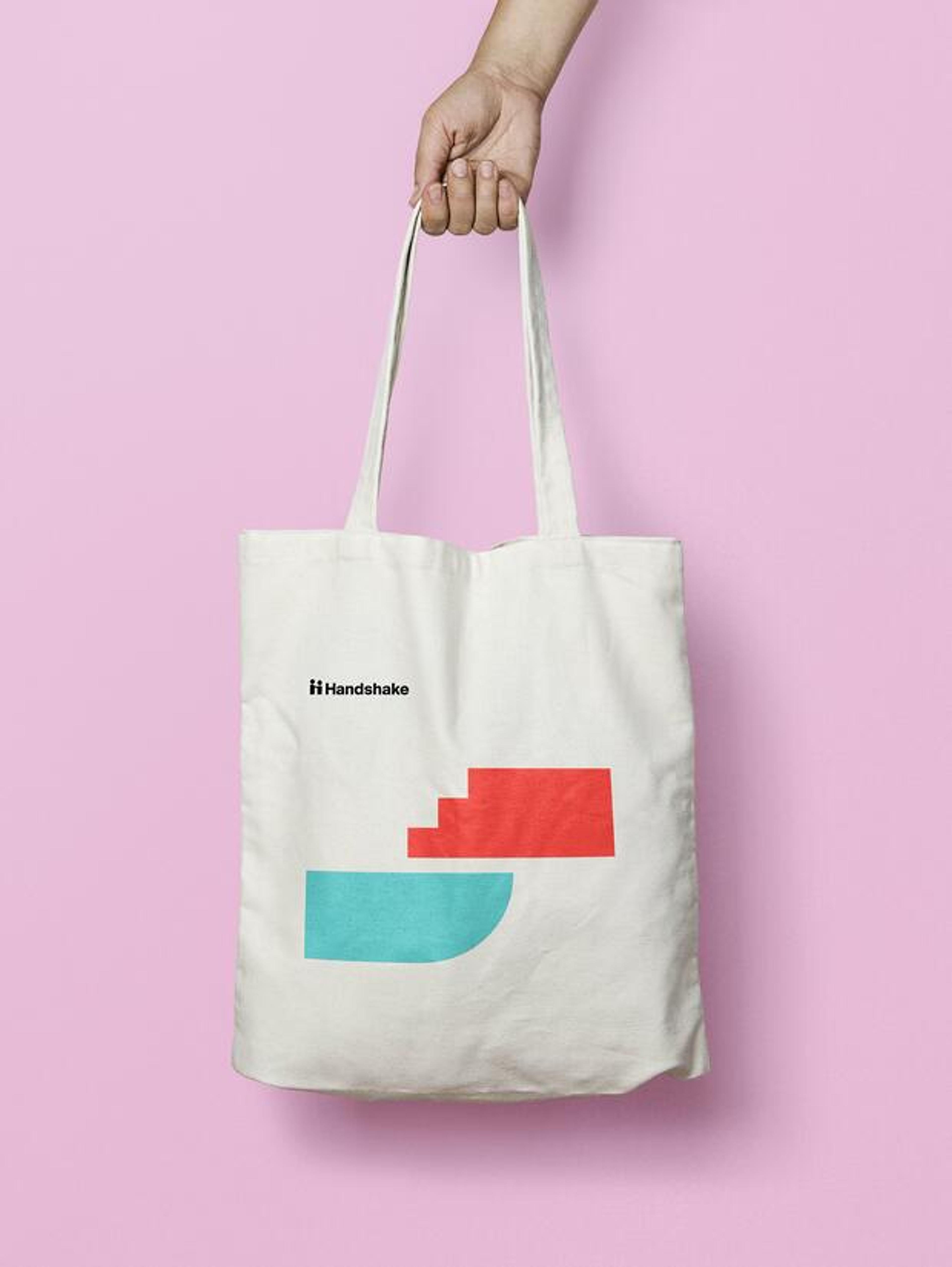
Our former color palette of yellow and blue is common in the university space and among other job platforms. We decided to create a color palette that stands out and is authentic to Handshake’s personality. The primary brand colors of red and turquoise give Handshake a boost of energy and an element of action. Our secondary palette of blue and pink add a sense of refinement and focus. White provides the backdrop, helping create space and breathing room to let our core colors shine.
We chose Suisse Int’l as our system typeface because of its wayfinding quality; it signals that we are helping students, universities and employers find what they’re looking for. It’s clear, instructive, actionable and friendly. For quotes and editorial, we chose a serif, Suisse Works, to complement our primary typeface and help our stories shine.
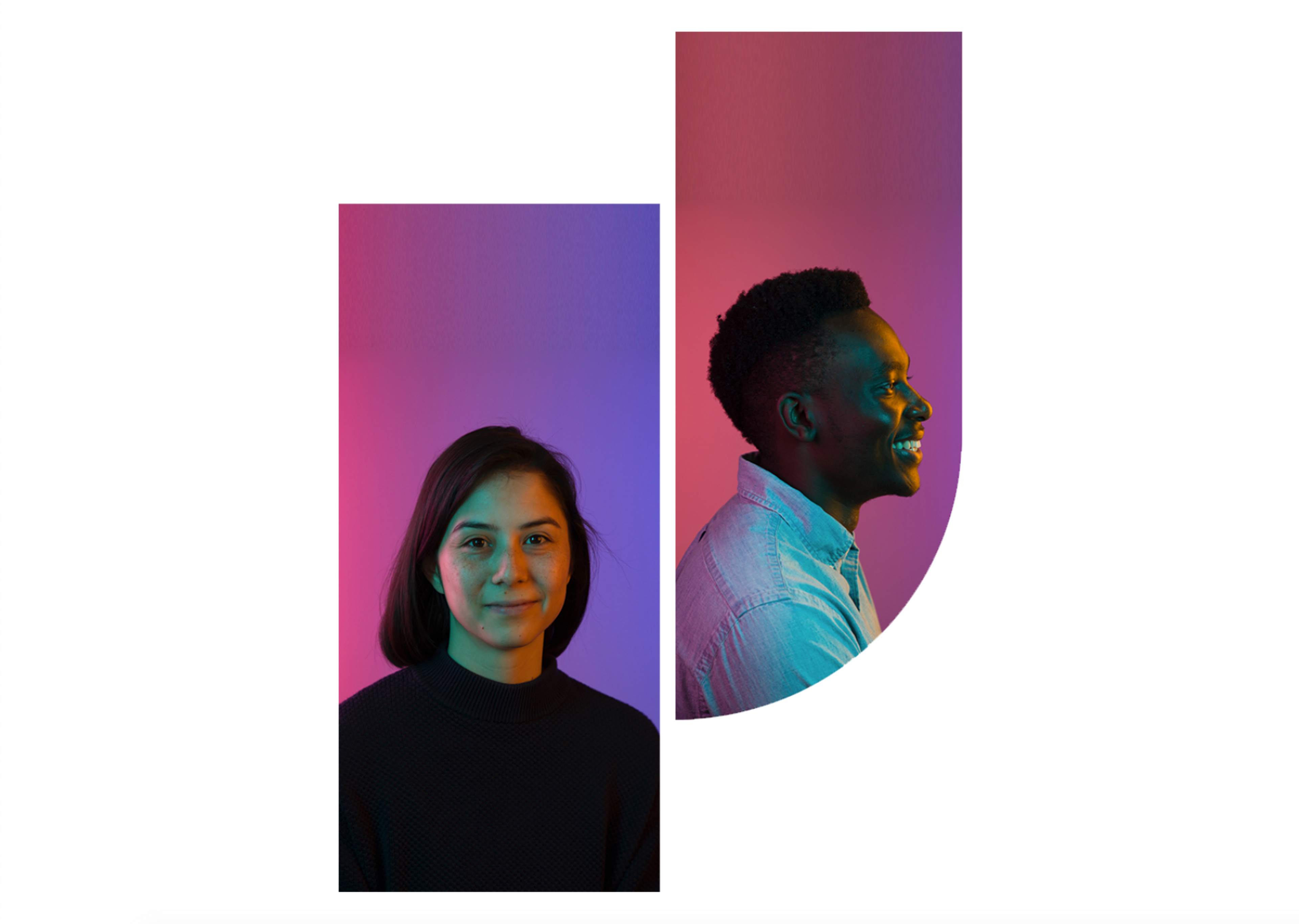
You’re going to begin seeing more photography on our website and marketing—photos of real students, employers, and universities. Photography is a great opportunity to reflect the communities we serve, and to highlight success stories. Like our language, our photography will be vibrant, optimistic and authentic. Overlaid on the photography and throughout our marketing and product, you will see a series of shapes that are vibrant and a nod to our name. If you look closely at the patterns, you’ll see an abstract handshake—the shapes represent the journeys of people in our community coming together.

It’s been an honor to lead this change with a team that is deeply invested in our mission and passionate about ensuring the value of Handshake shines through. We're thrilled to have this new brand platform for Handshake. And we're ever more determined to help everyone - universities, employers and students - to find your next!
